 |
| Clerkenwell Design Week Map. Source: clerkenwelldesignweek.com |
Showing posts with label Applied Arts. Show all posts
Showing posts with label Applied Arts. Show all posts
Sunday, 25 May 2014
Uncovering Clerkenwell Design Week 2014's Secrets


Tuesday, 28 January 2014
A Spaniard in London, Enrique Perezalba Red Interview in Klei Magazine. Issue 1, Jan/Feb 14
“I create seductive art that turns heads like a beautiful woman walking down the street.”
Sunday, 3 November 2013
The World According to Carol McNicoll, Interview in Klei Magazine
 |
| Klei Magazine 'Great British Special Edition' cover, featuring Clare Twomey's 'Monument' 2009 |
Recently I was asked to interview Carol McNicoll, the incredible British potter extraordinaire (a
noun I don't use lightly) for Klei Magazine on their 'Great British Special Edition' (Nov/Dec 2013), which also features Clare Twomey, British studio pottery and the recent happenings in Stoke-on-Trent.
I caught up with arguably the most industrious creative in Camden, nearly two years on after our Breaking the Mould interview during her 'Ideal Home' Marsden Woo exhibition back in late 2011.
For
those of you who don't speak Dutch (myself included), our
opinion-filled conversation consisted of French vs. British taste, the craft revival and whether she think it's still realistic to be an artist in the digital age.
 |
| 'The World According to Carol McNicoll' interview |
 |
| 'The World According to Carol McNicoll' interview |
Saturday, 10 August 2013
Hot Off the Press - Phoenix Fashion and Design Features
Like our Great British weather, PHOENIX Magazine's new summer issue 'Sunshine & Showers' is out now. Starring the sexy siren/tv kitchen goddess which is Gizzi Erskine (the only woman who can pose tattooing a piece of pork belly and still look smokin' hot), designer Tom Dixon and actress Vanessa Kirby, this issue's a scorcher not to be missed.

Here's a snippet from the magazine's 'The Showpiece' page I edited, a breathtaking smashed porcelain print dress by Latvian/Israeli London duo Fyodor Golan, from their 'Holy Mountain' collection.
Known for their attention to detail that dramatically accentuates the figure, I for one can't wait to see what their September LFW SS14 catwalk has in store.
 |
| Photo by Charlie Bettinson |
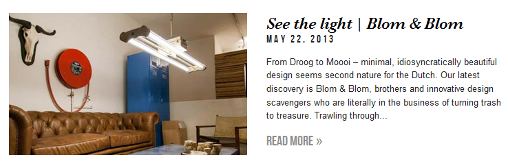
From 18k plated-gold teapots, up-cycled Cold War lighting to the flamboyant designer of 'Happy Chic', here's a few more PHOENIX pieces I've authored.
Click on the links below the images to read the whole story.

http://www.phoenixmag.co.uk/blog/designing-happy-chic-with-jonathan-adler/
http://www.phoenixmag.co.uk/features/blom-blom-lighting-design/
Tuesday, 2 July 2013
The Cream of New Designers' Ceramic Crop
 |
| David Marques (Central Saint Martins) |
David Marques
Central Saint Martins is one of the best ceramics BA courses in the country right now, judging from the calibre of its students' work. Marques is a Portuguese designer who has worked previously in the Geneva watch business. Remarkable attention to detail is evident in this stunning, functional clock with hand-painted gold transfers. It was custom made as part of an installation of seven cuckoo clocks for prestigious Portuguese porcelain company Vista Alegre's flagship stores in Lisbon and Porto.
 |
| Annie Jones (University of Sunderland), |
Annie Jones
Is it a miniature garden? A new form of cigarettes-in-plaster contemporary art? Just some of the wild (and obviously wrong) possibilities that crossed my mind when I first saw Jones' intriguing vitrines. Jones' living laboratories are an ongoing body of research exploring the contained reactions of raw chemicals in clay bodies, over time and exposed to varying conditions. The effects fluctuate massively and result in striking patterns and vivid colours, like the container above showing purple crystallised chalks drawing up green copper oxide (a potent glaze colourant) from the white porcelain, a process known as chromatography.
 |
| Ant Pipe (De Montfort University) |
Ant Pipe
Repurposing moulds and debris collected from the derelict Spode factory site in Stoke-on-Trent, Pipe pays homage to the 18th century innovators who made English fine bone china world famous. The make-up-like hues and textures of the miniature pots range from the smoothest white to the blackest, rock-like of clays – a delight to the senses.
 |
| Charlotte Mary Pack (Central Saint Martins) |
Charlotte Mary Pack
Having raised in a farm, Pack's love for animals is unquestionable, exemplified by an astonishing installation of tiny hand-modelled and sculpted porcelain mammals on the endangered species list (I lost count, but over 200 would be my guess). All creatures big and small are included – from a tree rat that measures approximately 10mm by 5mm (slightly bigger than a tic-tac), scaling up to the lifelike, fist-sized mountain gorilla. The designer has plans to make a similar work raising awareness on reptiles facing extinction due to man-made destruction. Surely a commission from Stella McCartney is on the horizon?
 |
| Carys Joan Evans (Falmouth University) |
Carys Joan Evans
Perfectly proportioned at around a foot, Evans' elf-like human and flora hybrids encapsulate the imagination of the young Welsh maker who counts landscapes as a huge source of inspiration. The mellow brown, green and yellow glazes as well as the unusual organic materials she incorporates (boar hair for instance) brings her charming 'walking forests' to life.
New Designers Part 2 (focusing on visual communication, industrial and spatial design), opens July 3 - 6.
Image credits from top: (David Marques) studiodavidmarques.com, (Annie Jones) Photography by Jo Howell on annie-jones.com, (Carys Joan Evans) carysjoanevans.wix.com. All other images taken by me with permission of artist
Sunday, 30 June 2013
We Found Love in New Designers
It's no secret that I am a big fan of New Designers. I'm admittedly a bit biased, but in my opinion it is the biggest, most eclectic, exhilarating and frankly underrated design degree show in the UK - and as it's summer, there's no shortage of them to explore right now.
The best thing about New Designers is that there really is something for everyone and no two sights are ever exactly alike. For me textiles this year was particularly memorable - we're seeing boundaries pushed with experimental, unconventional materials, cutting-edge techniques and diverse outcomes, from fashion, interiors and furnishing fabrics to sculptural and conceptual surfaces. Interestingly the line between mediums seems to be increasingly dissolved; for example, clay as a form of textile, either as repeated compositions or inserted components. Who knows? Maybe literally putting on your best china (check out Li Xiao Feng's ceramic couture here) isn't too impractical after all.
The 5 New Textile Talents to Know
Aisling Duffy
Creating crazy coloured digitally-printed fabrics, 3D-embroidered and charmingly childish ceramic accessories, Duffy works in mysterious layers that reveal the private/public aspects of our lives. Her work has that infectious, slightly psychedelic 'happy effect' much like Meadham Kirchoff (which she counts as inspiration), Ashley Williams and Sophia Webster which is trendy and highly marketable right now.
Ellys Beale
Ellys Beale's fierce wolf and graphic Aztec fashion prints caught my eye in an instant. With a discerning eye for detail (her pieces would make stunning editorials) and high-profile placements with Mary Katrantzou, Matthew Williamson and Diane Von Furstenberg under her belt, expect to find her pieces at a high-end designer boutique near you soon.
Si Chen
Chinese MA Textile Design Innovation graduate Si Chen shows us why minimalism is the design trend of 2013- subtle prints and simple shapes can be as powerful as loud colours, frills and patterns. Her inter-disciplined practice encompasses coordinated woven print garments, jewellery and prints as shown here. Titled 'Reflection of Shadows' the pale pink and monochrome geometric prints are based on fabric swatches created by the artist.
On the whole New Designers Part 1. was noticeably less chaotic and stripped back compared to previous years - welcome news to returning visitors (which you probably will be after your first). Gone are the unnecessary and eco-unfriendly printed maps, plus the layout was easier to navigate with more immersive multimedia displays rather than stands where you have to complete a 360 circle (If you're a student and think they're the best way to showcase the fruits of your three-year labour, they're not. They just leave visitors disorientated and make your work impossible to differentiate from the textile stands beside you, especially if you work in print).
If you enjoyed this post, look out for the upcoming feature on New Designers' ceramicists.
New Designers Part 2 (focusing on visual communication, industrial and spatial design), opens July 3 - 6.
(All images taken with permission of artist by me unless specified otherwise)
The best thing about New Designers is that there really is something for everyone and no two sights are ever exactly alike. For me textiles this year was particularly memorable - we're seeing boundaries pushed with experimental, unconventional materials, cutting-edge techniques and diverse outcomes, from fashion, interiors and furnishing fabrics to sculptural and conceptual surfaces. Interestingly the line between mediums seems to be increasingly dissolved; for example, clay as a form of textile, either as repeated compositions or inserted components. Who knows? Maybe literally putting on your best china (check out Li Xiao Feng's ceramic couture here) isn't too impractical after all.
The 5 New Textile Talents to Know
 |
| Aisling Duffy (Edinburgh College of Art) |
Aisling Duffy
Creating crazy coloured digitally-printed fabrics, 3D-embroidered and charmingly childish ceramic accessories, Duffy works in mysterious layers that reveal the private/public aspects of our lives. Her work has that infectious, slightly psychedelic 'happy effect' much like Meadham Kirchoff (which she counts as inspiration), Ashley Williams and Sophia Webster which is trendy and highly marketable right now.
 |
| Emily Plumbly (Norwich University of Arts) |
Emily Plumbly
Plumbly is a mixed-media print artist who constructs intricate, fabric-like sculptures using a heated 3D textile medium that feel as intriguing to the touch as it does to the eye. A simple yet painstaking technique that creates unsuspecting, unique and experimental effects - her white spiderweb-like pieces have an ethereal allure and organic growth about them which distinguishes her work from the crowd.
 |
| Ellys Beale (Loughborough University) |
Ellys Beale
Ellys Beale's fierce wolf and graphic Aztec fashion prints caught my eye in an instant. With a discerning eye for detail (her pieces would make stunning editorials) and high-profile placements with Mary Katrantzou, Matthew Williamson and Diane Von Furstenberg under her belt, expect to find her pieces at a high-end designer boutique near you soon.
 |
| 'Amble' by Harry Owen (Camberwell College of Arts) image: ambledesign.com |
Amble
Harry Owen's exquisitely North-London made 'Amble' leather collection epitomises what contemporary English craftsmanship is about - lovingly handmade, ethically sourced, one-of-a-kind pieces that only get better with age. Crated using rare English Oak Tanned leather from Devon (which feels and smells lovely in case you're wondering), leather accessories such as this gorgeous backpack are timelessly elegant and practical.
 |
| Si Chen (Nottingham Trent University) |
Si Chen
Chinese MA Textile Design Innovation graduate Si Chen shows us why minimalism is the design trend of 2013- subtle prints and simple shapes can be as powerful as loud colours, frills and patterns. Her inter-disciplined practice encompasses coordinated woven print garments, jewellery and prints as shown here. Titled 'Reflection of Shadows' the pale pink and monochrome geometric prints are based on fabric swatches created by the artist.
On the whole New Designers Part 1. was noticeably less chaotic and stripped back compared to previous years - welcome news to returning visitors (which you probably will be after your first). Gone are the unnecessary and eco-unfriendly printed maps, plus the layout was easier to navigate with more immersive multimedia displays rather than stands where you have to complete a 360 circle (If you're a student and think they're the best way to showcase the fruits of your three-year labour, they're not. They just leave visitors disorientated and make your work impossible to differentiate from the textile stands beside you, especially if you work in print).
If you enjoyed this post, look out for the upcoming feature on New Designers' ceramicists.
New Designers Part 2 (focusing on visual communication, industrial and spatial design), opens July 3 - 6.
(All images taken with permission of artist by me unless specified otherwise)
Friday, 14 June 2013
The Art of Hong Kong Eye, Saatchi Gallery
 |
| Inside Amy Cheung's 'Toy Tank' at 'Hong Kong Eye' |
Saatchi’s 'Hong Kong Eye' is an 18-course amuse-bouche of the region's brewing contemporary art scene. If there was any doubt, just look at renowned Swiss fair Art Basel's debut in Hong Kong last month – which attracted plenty of customers (including Kate Moss and Roman Abramovich apparently) eager for a slice of the massively lucrative market.
Sponsored by Prudential, Asia's leading corporate UK owned insurance company (the hint is in it's name), I was keen to discover how the show would, as its official introduction claims, “draw on (artists) specific cultural backgrounds to expose the city’s nuances” convincingly to new audiences.
Known as " The Pearl of the Orient", it’s easy to be seduced by the city's glossy patina: a teeming hyper-networked metropolis, breathtaking skyline boasting most Rolls-Royces per capita. But at what social/psychological price? This is unadulterated HK in the eyes of its own artists; where unspoken anxiety simmers headily throughout the exhibition.
 |
| Amy Cheung's life-sized wooden 'Toy Tank' |
Standing in the first room is Amy Cheung's full-size wooden ‘Toy Tank’, a loaded choice of material for a symbol so potent. Visitors are invited play combat; crawling inside the vehicle, submerged in darkness. Video screens and joysticks let one navigate and unleash gunfire within a simulated Saatchi Gallery. Complete with realistic sound effects, the haunting atmosphere and unmistakable echoes of Tiananmen are inescapable. Curiously lying in its path is Adrian Wong's five-foot animatronic peanut soft toy, convulsing like dying road-kill. Novel child's play aside, these examples show how local artists are incorporating the cutting-edge technology in their work. Compared to the west, its apparent lack of established arts infrastructure and rules appears to work in its favour.
Justin Wong’s 'Difficult Life Decision' encompasses two works. The first is a giant periodic table of stickered symbols across an entire wall. Parodying a typical gruelling cycle of work, stress and digitally-prompted demands, the day starts with "Email” and ends in “Blank”, contrasting with signs of human woes like “Why Me”, “Mortgage” and “Day Off”. It’s the blueprint of the kind of living mode Londoners are frighteningly catching up with.
 |
| Justin Wong 's 'Difficult Life Decision'' |
The second part is a kiosk that asks rhetorically “How Are U Today?” Conceived, explains the helpful touch screen, to “help overworked white-collar employees contemplate life or even create a new one”, by anonymously sharing their secrets, worries and pent-up frustrations. If Wong’s works visually encapsulate HK’s insanely-paced work ethic, the definitive soundtrack belongs to Joao Vasco Paiva's installation of MTR (HK’s underground) turnstiles. A clanging-metal racket so ingrained as a Hong Konger; I barely noticed how irritatingly loud it was it until now.
On more contentious ground, questions about China’s cultural identity are painted in Chow Chun Fai's iconic movie scenes of Chinese capitalist dreams. Everyone wants a piece of China now, but there is less concern for its own people, let alone those who speak openly about it. Issues like corruption seem to be subtly implied in subtitled actors' quotes − “China is not ruled by Chinese anyway”. Unlike the 'Korean Eye' or 'Indonesian Eye', unsurprisingly this is as controversial as it gets.
 |
| Chow Chun Fai, 'Legend of the Fist: China is not Ruled by Chinese Anyway' |
That being said, I don’t think 'Hong Kong Eye' was ever intended to expose its dark side. Intensity has always been the way of life; China didn't prosper by luck.
The most unique aspect shown is HK’s mongrel culture, owed to its rich history as a former British colony and international trading port. An incongruous collage of old meets new, east meets west under constant urban renewal. Ho Sin Tung’s 'LOVE HOTEL: Please pretend we’ve been to a lot of places' includes a collage of cards from locally-endangered seedy motels named after glamorous holiday destinations. “Venice Inn”, “Hawaii Guest House” and the delightfully misspelt “Romb Hotel” are kitschy delights you'd never find in a tourist map.
This is an show where somewhat frustratingly, no message or agenda is explicit. Contemplative effort, imagination and open-mindedness are needed to appreciate HK’s cultural fabric – which is complex, idiosyncratic and contradictory. However its mystic allure is a promising sign of big things yet to come.
Images from top: pbs.org, aesthetica.com, guardian.co.uk, ocula.com
Monday, 3 June 2013
London's Top 5 Treasure Hunts
Treasures old, treasures new, treasures worth the pilgrimage
to...Inspired by Channel 4’s ‘Four Rooms’* and my Blom
& Blom recycled lighting piece for Phoenix Magazine, trawling for
treasure has never been more fashionable. Here are 5 fantastic events where you
just might get lucky
Tuesday, 12 March 2013
Formafantasma Craftica Review, Gallery Libby Sellers, 1 - 28 February 2013
For the love of leather, I had to visit Craftica, a curious craft x design project commissioned by none other than Fendi
Friday, 11 January 2013
Hong Kong Freshly Brewed Blogs pt 1
Meet Brew and Post, the newest fashion-lifetyle blog network from Hong Kong.
Monday, 31 December 2012
Reminiscing...V&A Postmodernism: Style and Subversion
Any self-respecting writer will have a library of rejected manuscripts (I remember how I cried on my first), buried inside cobweb gathering tombs of laptop hard drives, never to see the light of day and usually for a good reason.
I am not one of those self-respecting writers.
So here's an attempt at Art Review-worthy critcism from the 2011 archives. Frank feedback in the the comments box below the post would be most welcomed. The sharing icons are in grey above each post, which I still haven't figured out how to change...
I've written my fair share of embrassing, self-indulgent, juvenile rubbish, but reflection's the only way to learn right?
I've written my fair share of embrassing, self-indulgent, juvenile rubbish, but reflection's the only way to learn right?
Get in touch
Facebook Christina's Anatomy
Twitter @ChristinaLai1
Google+ Christina Lai
Postmodernism: Style and Subversion, 1970-1990
at the V&A
(24th September 2011- 8th
January 2012)
 |
| i-D, no 28. The Art Issue, August 1985, photograph by Nick Knight, featuring Lizzy Tear.V&A |
Postmodernism: Style and
Subversion is one of the VA’s most exciting projects to date. Divided into 3 sections-
Architecture, Style and Money, it examines radical ideas that defined the
movement between 1970- 1990. Its proliferation is chronicled through
stimulating exhibits- from Architecture, Art and Design to Film, Music and
Fashion. It’s ambitious to showcase a hotly contested movement, one which we
are arguably still living in. I fell slept through Postmodernism lectures at
university, so I was curious to understand what the fuss was about.
To some, it might be synonymous
with Andy Warhol soup cans and Madonna’s fashion choices- but few are aware of
its anti-modernist roots in architecture. Postmodernism is portrayed as a
phoenix rising from the ashes of modernism in the 1970s, a liberation from its
restrictive orthodoxies of function, clarity and purity. A full-scale replica
of Hans Hollein’s façade (1980) from the Venice Biennale is one of the
most theatrical exhibits. Each pillar samples a period in the history of
architecture, from the Garden of Eden, classical Greek ruins to industrialist
Art Deco. The pastiche is deliberate and unabashedly artificial (think Las
Vegas novelty hotels); playfully cutting-up-and-pasting memorable fragments
from the past.
The bricologe, cut-and-paste
ethos was not limited to styles and ideas. It brought unconventional materials
and different processes together to create a new synergy. This is evident in
Paul Astbury’s ceramic sculpture, Box(1980). At first glance it’s an
unremarkable, tatty white box hastily assembled with discarded scraps. The
broken fragments are actually fired ceramic tiles, individually fixed with
screws to the cardboard box, an unconventional mosaic tessellation. These are
accented with strokes of custom blue and brown tinted araldite, sellotape,
paint and felt tip markers. The complex layers and strategic placement of
colours makes one wonder how much of its appearance is coincidental or
deliberate. Personally, excavated remnants of demolished Modernist architecture
come to mind, eschewing progress; suggesting the present is merely an amalgam of
antiquity. It’s an intriguing, tactile synthesis of everyday materials;
refreshingly contemporary even for today.
 |
| Box, 'Untitled', Paul Astbury, 1980. V&A |
The music and performance (style)
section is not to be missed. The set (known as ‘The Club’) recreates the
electric atmosphere of an underground fetish night club from 1980s, complete
with coloured spotlights, elevated stages and wire fences. The kind your
parents would not approve of. David Bowie, Grace Jones and other 80s pop videos
repeat (annoyingly) on huge screens- charting MTV’s pivotal role of channelling
postmodernism to the mainstream audience of style conscious youths. David
Byrne of Talking Heads’ Big Suit(1983) and Grace Jones’ cubist
sculptural maternity dress (made of cardboard and felt in 1979) are just
some of the zany outfits on display. Colourful, exaggerated appearances
conveyed dissident, self-referential personas critical to these artists’
successes.
The most extreme style statements
are perhaps the male and female ballet costumes designed by Leigh Bowery for
the Michael Clark Company’s production, Because We Must(1987).
Beige balaclava-attached corset bodices are covered in exquisite crewelwork,
depicting pink, orange, gold and green sequined flowers- reinterpreting an
embroidery technique historically used for curtains. Complete with pink lycra
sequinned leggings, I imagine it would make Lady Gaga blush. The mysteriously
covered faces (with just 3 holes for sight and respiration) and sexually
provocative corset-bodies fetishize domination and submission. Epitomising fluid
postmodern gender identities, they bring a body-conscious, androgynous
‘otherness’ Bowery’s work was famous for.
 |
| Dance costumes for performance 'Because We Must', designed by Leigh Bowery, 1987. V&A |
The last section explores the
impact of money on postmodernism during the economic and consumer excesses of
the 1980s to its demise in 1990. The luxury products of ‘design editing’ are
enticing, a precursor to the current trend for artist/designer/high street
collaborations. It marks the change when designers happily merchandised their
services to mass market brands like Disney and Alessi. An iconic example is
architect Michael Graves’ Mickey Mouse Gourmet Collection(1991). A
tea-set with mouse-shaped handles and whistling Mickey spout cover reflect a
humorous, ironic self regard that defined pop culture. One can’t help but
lament a ‘selling out’ for fame and profit, relinquishing the creative freedom
postmodernists fought for in the first place. Money was power, but it also
tainted postmodernism with a ‘vulgar decadence’ that still niggles, whether we
admit or not.
For visitors unfamiliar with
postmodernism, this is a dynamic introduction to its many ‘broken facets’. The
ideas radical at the time shaped and continue to influence the world we live in
today – from parody, pluralism, bricolage to a return to kitsch and nostalgia.
There are too many objects for one to thoroughly evaluate; leaving many
questions not fully answered (Is Postmodernism dead? Does it even matter?).
However, like a time-travelling rollercoaster of unsettling, sensory thrills,
it’s more fun to do a David Byrne and ‘Stop talking sense’.
Friday, 26 October 2012
The Harrow Effect, Craft & Design Magazine
I am so, so proud that my article on the closure of Harrow Ceramics (University of Westminster) is featured in the latest Nov/Dec issue of Craft & Design Magazine.
http://www.craftanddesign.net/
You can find Craft & Design at WHSmiths and good libraries. It's packed with comprehensive advice for designers, fantastic photos and up-to-date coverage on the British contemporary craft scene. Believe me, it's well worth the rummage.
Thank you for all of the artists, staff who contributed and of course Craft & Design editor Angie Boyer for taking a chance on a novice writer like me.
You can read the article in full screen mode by clicking the following link
The Harrow Effect by Christina Lai, Craft & Design Magazine Nov/Dec 2012 Issue no. 224

http://www.craftanddesign.net/
You can find Craft & Design at WHSmiths and good libraries. It's packed with comprehensive advice for designers, fantastic photos and up-to-date coverage on the British contemporary craft scene. Believe me, it's well worth the rummage.
Thank you for all of the artists, staff who contributed and of course Craft & Design editor Angie Boyer for taking a chance on a novice writer like me.
You can read the article in full screen mode by clicking the following link
The Harrow Effect by Christina Lai, Craft & Design Magazine Nov/Dec 2012 Issue no. 224
Subscribe to:
Posts (Atom)
LinkWithin
